Guys,
Some of you may recall that I'm the graphic designer for a university physics department. In my efforts to "plus" the designs of things people actually see daily, I've decided I want to spruce up the signage in and around the three buildings that make up the core of our department. I designed some of what we currently use — 10 years ago. Time for a change — and I want to up the ante.
I saw some signs at Walt Disney World recently, in the "Mission: Space" attraction at Epcot, along with a new typeface* at the neighboring Test Track ride.
The signs I saw were dimensional. They had curved tops and bottoms and straight sides. The tops and bottoms were thin along the outer edges — say, an eighth of an inch, and sloped thicker toward the middle. In other words, if you took on off the wall and laid it flat on a table, the curved edges would be like ramps. They probably went from an eighth-inch to a quarter-inch. Everything was painted silver or, in a few cases, finished in polished metal.
This is the design I'm stealing, more or less. On the interior, I'm just simulating the dimensionality. I got our machine shop to cut a piece of plexiglass with a curved edge, and I use that to cut a curve in the foam board I use for interior signs. But on the exterior of the buildings, I want something a bit nicer. I'll still need to do a section of the signs in foam board, laminated to protect from rain and humidity. But I want to use something with some depth, other than foam board, for the curved sides (because the curves would mean I can't do the all-encompassing lamination. If I can approximate the "ramping up" in thickness, so much the better. But it has to be relatively easy, inexpensive, and lightweight.
I was originally thinking to use sheet styrene for those parts, primed and painted silver. But it would still be flat. So then I thought of wood, laminated with styrene. If I go that route, what's the best way to bond one to the other? JB Weld? Is there another material besides wood that would meet my needs? Remember, it has to be cheap! I may have to pay out of pocket for this — at least for the first one. The finished pieces I need to make will be about 20 inches wide and maybe five inches or so tall at the tallest point. Is there any simple way to build in he slope/ramp/"blade" shape I mentioned, or is flat the way to go? The finished signs — at least eight, possibly 12 of them — will be outdoors but protected from direct rainfall. A couple may be subjected to strong sunlight part of the day (I'm not certain yet because I'll be putting these up considerably higher on the buildings than the current ones, to make it harder for students to steal them). Any advice regarding adhesives and paint choices and prep methods, considering these factors, would be greatly appreciated!
* For those of you who have yet to bail — The font apparently doesn't exist as such, as I've been unable to find a match. So, working from the letters T, E, S, R, A, C, K, I'm attempting to draw the rest of the font in Adobe Illustrator. This is difficult! Even though I have a template, the curves on the "S" are killing me, at least making them truly smooth. My initial attempt looked great, until I scaled it up to something like 2000 percent. I'm going to try again, using my earlier attempt as my new template, but I'll start at 2000 percent! There a re few characters that are giving me fits; do any you other designer types know of a community/forum of font design experts who could advise me? For example, on the sample I have of existing letters, all vertical strokes are very wide and all horizontal strokes are much thinner. The middle curve in the "S" is a diagonal, more or less, but is wide, and the top and bottom are thin. But I'm vexed a bit with N and M. Making them all wide will look ridiculous and unwieldy, and the M will just be too wide …
Qapla'
SSB
Bonding styrene to … wood? Or is there a better choice?
Moderators: DasPhule, Moderators
Bonding styrene to … wood? Or is there a better choice?
“The entire concept of pessimism crumbles the moment one human being puts aside thoughts of self and reaches out to another to minister to her suffering. The experience of either person can neither be denied nor adequately explained by a negative philosophy.”
-- Michael J. Nelson, Mike Nelson's Mind over Matters
-- Michael J. Nelson, Mike Nelson's Mind over Matters
-
Johnnycrash

- Posts: 5563
- Joined: Fri Jul 12, 2002 12:57 pm
- Location: Timmins, Ontario, Canada
Agreed, pics would be good. 
For styrene to wood, I'd use contact cement. Roll or spray both mating sides, let dry and stick 'em together. Once you place them together though, they're >stucktogether<.
Could you make a male buck pattern and vac-form Sintra board for the main body of the signs?
http://www.myfonts.com/WhatTheFont/
Winners don't use question marks!
Working on a way to get some photos online -- don't want to use my regular Flickr account for this sort of thing.
A little background: The department has an official seal, and it gets used a lot on posters, signs, certificates, you name it. But it is a bit formal, and I had been thinking that in addition to the seal, we need a more informal logo for many uses.
Qapla'
SSB
A little background: The department has an official seal, and it gets used a lot on posters, signs, certificates, you name it. But it is a bit formal, and I had been thinking that in addition to the seal, we need a more informal logo for many uses.
Um ... I ... don't know? Never tried to do any vacuum-forming. Presume the budget for this project is $20 plus materials on hand. And the thing is ... I'm taking the initiative here. We've repeatedly asked over the last decade to be able to design and outsource professional signs for the building, and we always get turned down. So I'm going to make at least one of these and install it and then I'll try to ask for money for materials to make the rest, presuming the initial attempt meets approval. Another reason this is a bit of a stealth project is that if I try to get other higher-ups involved, they'll start mucking with the design. For example, school colors are garnet and gold. They're nice colors and look good together (Iron Man likes 'em), but I get tired of people thinking everything would be cool if it was in garnet and gold. Things just kind of fade into a sort of garnet and gold noise after a while. So I want silver signs -- not really made to simulate bare metal, but clearly painted silver. I'll still use garnet for letters, most likely, maybe with a little gold trim. But if were to replace the silver with gold, as some would likely argue, the design goes from "space age" and what I would describe as "playful utilitarian" to "ostentatious." Don't want that.DennisH wrote:Could you make a male buck pattern and vac-form Sintra board for the main body of the signs?
That was the first place I looked. No match found and no nibbles from the forum, either. Closest thing I have to a match is Serpentine Sans Bold Oblique, but it's hardly a match.DennisH wrote:http://www.myfonts.com/WhatTheFont/
Qapla'
SSB
“The entire concept of pessimism crumbles the moment one human being puts aside thoughts of self and reaches out to another to minister to her suffering. The experience of either person can neither be denied nor adequately explained by a negative philosophy.”
-- Michael J. Nelson, Mike Nelson's Mind over Matters
-- Michael J. Nelson, Mike Nelson's Mind over Matters
-
Johnnycrash
- Posts: 5563
- Joined: Fri Jul 12, 2002 12:57 pm
- Location: Timmins, Ontario, Canada
Could you carve/sand/finish it out of a piece of blue or pink insulation foam? You'd have to really finesse it to get it presentable, but it might get your idea across.Presume the budget for this project is $20 plus materials on hand.
Is this a picture of the font you're talking about?
http://yourfirstvisit.net/wp-content/up ... -Epcot.jpg
Winners don't use question marks!

Yes, that's it. Below, see a link to a more useful promo image I found that is the basis for my efforts.DennisH wrote:Is this a picture of the font you're talking about?
http://yourfirstvisit.net/wp-content/up ... -Epcot.jpg
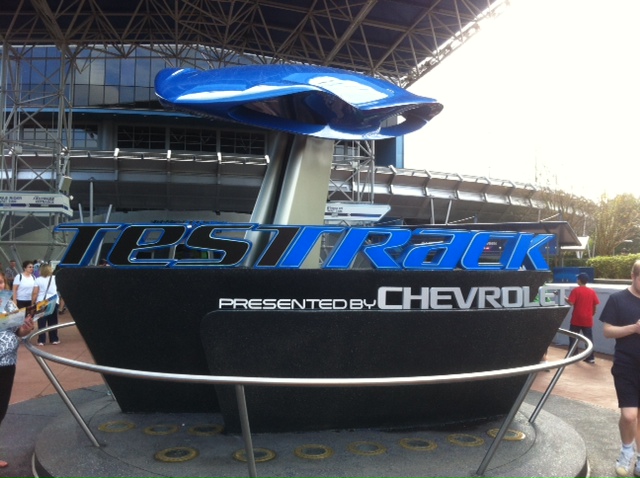
First, here's an image of the sign I saw that is my model for the shapes and style of sign I'm making: http://s1367.photobucket.com/user/The_N ... 1.jpg.html
Here's another one with an additional area at the bottom that I might adapt if I see the need: http://s1367.photobucket.com/user/The_N ... 5.jpg.html
The font Disney is using for these is Bank Gothic, which I have and may choose for these. Another candidate is a font called Dax. I may also use the one I'm creating below. However, I'm stealing that arrow design 100 percent!
This is an image of a prototype interior sign that created with a cobbled-together version of the typeface I'm designing (this font is made of mostly modified Serpentine Sans Bold characters, slanted to make them oblique). Compare this to the sign in the first link above. http://s1367.photobucket.com/user/The_N ... 3.jpg.html
Behold a better image of the original Test Track logotype, gleaned from a promo wallpaper image Disney released when the ride reopened: http://s1367.photobucket.com/user/The_N ... 6.png.html At the top is the original (I removed the split T in the middle because I wouldn't use that part), and just below it is the "un-skewed" version I made to use as a template; it is a lot easier to draw straight horizontal and vertical lines than all those angles.
Finally here are some of my work-in-progress extrapolations from the above image. "Resonances" is the name of the department newsletter; and the bottom row shows characters with variant forms I'm considering: http://s1367.photobucket.com/user/The_N ... c.png.html
Of course, the original logo uses lower-case looking characters for the two vowels. I was going to do that, but the U and O barely look any different and the I looked stupid no matter what I did with the dot. I did keep features I thought a lowercase Y would have. I also like the idea of using a lowercase-style character if it looks like another letter rotated, as with N and U, so I went with a lowercase N -- because I suspect the E and A are lowercase is because they look almost the same except for the way they rotated. The idea of what to do with the M is giving me fits. Doing it like an extended version of the lowercase N looks ... wrong -- and is seriously too wide (I'm already planning on creating a versions of this font with narrower characters, just for the sake of usability).
But for the exterior signs, the middle portions would extend out about 10 inches to either side. 20 inches is about the limit of what I can ask for a template from the machine shop, and I think that will look okay to have a 40-inch sign with a 20-oinch top and bottom framing device ...
Thoughts? Ideas?
Qapla'
SSB
“The entire concept of pessimism crumbles the moment one human being puts aside thoughts of self and reaches out to another to minister to her suffering. The experience of either person can neither be denied nor adequately explained by a negative philosophy.”
-- Michael J. Nelson, Mike Nelson's Mind over Matters
-- Michael J. Nelson, Mike Nelson's Mind over Matters
I really like your mock up. I'm almost thinking that you wouldn't need the tapered effect around the edges and possibly continuing the rounded edges on the left and right sides as well. Just an overall flat thickness with the recessed lines and text.
That "m" is a bugger. I've been staring at it for a while now. The only thing I'm coming up with is using your lower case "n" outline and "v-ing" the middle of it to make the "m" shape while still matching the "n" contours, maybe just a hair wider.
That "m" is a bugger. I've been staring at it for a while now. The only thing I'm coming up with is using your lower case "n" outline and "v-ing" the middle of it to make the "m" shape while still matching the "n" contours, maybe just a hair wider.
Winners don't use question marks!
Thanks! Well, my original plan was to use only single pieces of foam board for the interior signs (that part still stands) and cut a similar but larger top and bottom shapes from styrene. Styrene because I can't laminate the curved parts to protect them from the elements, but I can paint those parts and then use laminated foam board in between the curved portions for the printed parts. Then I got to thinking and wondering if there might be a relatively easy way to give the curved portions more thickness than just the styrene itself, because that alone will look like paper from any distance and thus even thinner than the foam board. The printing is done on an Epson 9800 Stylus Pro, which is probably darn near an ultimate toy for one such as myself. Man, that thing is sweet! As for the idea of having curves all around, I think what I'm actually going to do is put directional and room signs in boxes like the one I showed here. Informational signs (Exit, stairs, men, women, that sort of thing) I may do with curved sides and a straight top and bottom.DennisH wrote:I really like your mock up. I'm almost thinking that you wouldn't need the tapered effect around the edges and possibly continuing the rounded edges on the left and right sides as well. Just an overall flat thickness with the recessed lines and text.
I've considered something like that. It isn't a bad idea, at least in theory. That middle leg could be treated the same as the crossbar in the R, so that it comes down only part of the way and therefore might not look odd not being as wide and the other two verticals. Not sure yet what I'm going to do.DennisH wrote:That "m" is a bugger. I've been staring at it for a while now. The only thing I'm coming up with is using your lower case "n" outline and "v-ing" the middle of it to make the "m" shape while still matching the "n" contours, maybe just a hair wider.
Qapla'
SSB
“The entire concept of pessimism crumbles the moment one human being puts aside thoughts of self and reaches out to another to minister to her suffering. The experience of either person can neither be denied nor adequately explained by a negative philosophy.”
-- Michael J. Nelson, Mike Nelson's Mind over Matters
-- Michael J. Nelson, Mike Nelson's Mind over Matters